I am reminded daily that we live in an age of wonders. To find out where somebody lives, I plug in their address into any one of a number of mapping web applications, and instantly see their neighborhood, detailed satellite views, driving directions, even gas stations nearby should I need to stop by one. I can similarly figure out who people are and how I’m connected to them with a variety of social networks, and all these data are delivered painlessly: No flipping through gargantuan phonebooks, no need for obscure incantations to formulate database queries.
Scientific visualization has been catching up in fits and starts to this new world of ubiquitous and trivially accessible relationship data. This is partly due to the inherent complexity of scientific data, and partly due to the vastly smaller user base that would benefit from such an endeavor, and the limited resources available to researchers. There are certain scientific datasets, however, that are eminently suited to benefit from this new visualization paradigm.
Consider the phylogenetic tree of living creatures: representing how different species are related to each other. Long ago in school, for example, I was taught that tetrapods (vertebrates, except for the fishes) were grouped into amphibians, reptiles, birds and mammals, pretty much in that order and with very little sense of how little or much diversity each of those groups encompassed. Since then, genetic sampling has revolutionized our understanding of the tree of life. However I’m pretty confident that kids are still taught about amphibians, reptiles, birds, and mammals, in pretty much that order. Perhaps somebody mentions that the dividing lines aren’t quite as clear-cut anymore, but that probably just muddles things even more.
James Rosindell and Luke Harmon took on this problem of visualizing the modern, genetics-based understanding of phylogeny in a way that is accessible to the general public. Their approach was inspired by the navigation conventions of Google maps, and by the aesthetics of fractals, especially the tree-like L-systems.
When you open their phylogenetic tree viewer, called OneZoom, to the tetrapod tree, you’ll see what looks like a slightly abstract drawing of a tree. Superimposed over some of the smaller branches are labels for various groupings of animals: Amphibians, Mammals, Lizards and Snakes, followed by Turtles, Tortoises and Terrapins, then Crocodilians, and finally Birds… wait. What? What happened to Reptiles? And why are us amazingly highly evolved mammals ignominiously wedged in between frogs and lizards?
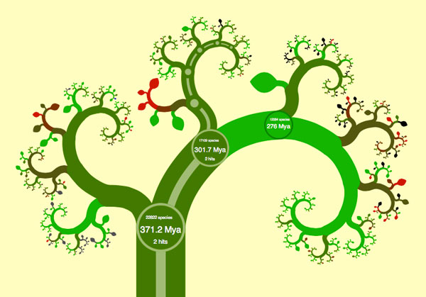
To answer these questions, it pays to play around with OneZoom. The visualization tool invites interactive exploration much like Google Maps, so let’s start clicking and dragging on the tree as if it was a map. As you click on mammals, new smaller branches instantly come into view. You can now see the main groups of mammals displayed: Monotremes (platypus), marsupials (opossums and kangaroos) and placental mammals (us). You’ll also notice that new circles pop up whenever major branches split. These circles have some numbers and abbreviations in them that turn out to be a key to understanding what’s going on. The circle at the base of the mammals branch, for example, says “301.7 Mya” – This means that the corresponding split in populations that caused the mammals to branch off and distinguish them from the reptiles and birds occurred 301.7 Million years ago. The other number in the circle tells us that there are 17109 currently living known species that originated from this split. Once you zoom in on the mammalian branch, you can see that there are only 5025 known species of mammals alive today, and that Monotremes (egg-laying mammals) split off from the rest of us mammals about 166.2 Million years ago. (Sometimes you have to zoom in quite a bit on a branch or a leaf to see all the details about it). The data is mostly gathered from genomic studies of the various organisms, and it reflects our best guess based on the degree of genetic difference between species.
You can continue zooming in on parts of the tree in this fashion, and you’ll soon see that individual species are represented reasonably enough by leaves, in keeping with the tree analogy. You’ll be able to see each species’ conservation status, whether it’s endangered or not, and the default coloring of the tree reflects this status. The visual effect is neat – you can see what parts of the tree are healthy – they’re bright green – and which parts are in danger of extinction – they’ve turned brown or worse, red. Further, each leaf has a link to that species’ corresponding Wikipedia entry. I found myself wishing that I could see a wikimedia photo of the species right there on the leaf, but I found the link alone an acceptable way of connecting this visualization to further information. At this point I should mention that I spent more than a couple of hours “researching” by clicking around the tree and familiarizing myself with the new phylogeny. I’ve always been a bit of a zoology geek, memorizing large sections of books like “Mammals of North America” back when I was a kid, so this dataset visualization was surprisingly addictive for me.
After I spent some time exploring, answers to the questions raised earlier began to emerge: I noticed that as I followed any branch from root to leaves, the dates in each split are arranged in chronological order. Any split further “up” the tree occurred more recently than a split closer to the trunk (there are some cases where the same date is repeated along a few successive splits – this happens for example with Agoutis, Chinchillas, Old World Porcupines and Mole Rats – this is caused by the exact sequence of splits not being clear from the data, so a guess of the splitting order is made). Also, at any junction, the branch with more species on it inevitably takes the right-hand of the split. This leads to an impartial view of tetrapod taxonomy: Species end up where they are on the tree not through some arbitrary artistic choice, but thanks to a rigid set of criteria: The more prolific branches of life (species-wise) always continue rightwards (actually clockwise in the default view).
And what does this say about us humans? We’re not so biologically distinct from our neighbors as to land a coveted “big” leaf spot to the left of any major branch (the lonely Tuatra gets the ultimate honor in that department), and we’re nowhere near the phylogenetically prolific “tip” of the tree – that’s reserved for songbirds in general, and Flowerpiercers in particular. We’re just not all that phylogenetically special: We diverged from chimps & bonobos around 8.8 Million years ago, from gorillas 11.5 Million years ago, from Orangutangs 18.4 Million years ago, from Gibbons (of which there are a healthy 14 species) 21.9 Million years ago, and from the rest of the Old World monkeys some 35.4 Million Years Ago. What is unique about us is that we’re the only green leaf on an otherwise distressingly brown-and-red branch of the tree.
Once I sated my first rush to click and drag all around the place, getting a feel for the overall layout, I slowed down to look at some other features that make this visualization such a delight. First up, the shape of the tree can be switched between one of several different fractal styles. If the fern-like curling frond (default) look isn’t for you, you can also go for a more spruce-like upright tree, or a symmetrically branching oak-like thing. The data are the same, and each layout is completely automatic, so let your personal preference be the guide. Likewise, colors can be switched from the conservation status default to something closer to the tree analogy: Brown for branches, green for leaves.
The search function is also a delight: I brought up the search bar (binoculars icon, top right), looked for pandas, and in the process received my next little taxonomic shock. Red pandas and Giant pandas, it turns out, are only distantly related. If I understand the graph correctly, Red pandas are more closely related to Seals, Sea Lions and Walruses than to giant pandas! The way that search results are displayed on the tree is a visual treat as well. A path appears for every match to the search term, that wanders up from the base of the trunk to each leaf that satisfies the search terms. This allows you an easy way to inspect where, for example, the path to the giant panda splits off from the path for to red panda (it’s 49.5 Million Years ago).
One of the neatest features, though, is the growth animation function. Zoom out until you have much or all of the tree in view, then click the icon that looks like a sapling being showered by a watering can (appropriate, that). You’ll then be treated to an animation of how the tree grew, with branches and leaves being added in proportion to their branching date. What’s amazing to me in this view is the stunning variety of bird species that arrived on the scene relatively recently.
Speaking as a designer, I respect the artistic choices made in OneZoom: The thickness of branches, the way they curl in the default mode, the spacing of the various elements and gradual introduction of more information as you zoom in, all made this a compelling interface for me. I could – and did – play with it for hours, and believe that just as there are many people who will use Google Maps to actively explore geography, there will be many students who, in the process of looking up some specific phylogenetic fact, will get sucked into exploring the tree of life for its own sake, and will likely emerge with a renewed appreciation for the dizzying variety of species alive today, and the web of genetic relationship that binds them all.
References
Rosindell J, Harmon LJ (2012) OneZoom: A Fractal Explorer for the Tree of Life. PLoS Biol 10(10): e1001406. doi:10.1371/journal.pbio.1001406
Corrections
Jeffrey Joy was initially listed as one of the co-creators of OneZoom. While he contributed significantly to various aspects of the project, he is not one of the original authors of the software.
Maciek Smuga-Otto
Latest posts by Maciek Smuga-Otto (see all)
- OneZoom, The Fractal Phylogenic Tree Explorer - May 24, 2013
- Bacterial transformation and counting colonies for grade school students - April 26, 2013
- Science in the Service of Art - February 27, 2013
Reblogged this on Promega Scientific Training and commented:
Check out the visualization of the phylogenetic tree of living creatures, produced by James Rosindell and Luke Harmon, called OneZoom! It’s absolutely fascinating!